Can you see the stickman behind the letters? Or the letters behind the stickman? Introducing the brand new logo of Jehzlau-Concepts.com. I finally made a bold move to change my good old handwritten logo to a brand new logo depicting two elements in one figure—The blue stickman (but now with a lighter hue) and the acronym J and C (Jehzlau Concepts).
I made it more simple and more modern. I noticed that the trend nowadays are flat, light and neat (no skeuomorphism anymore), like the iOS7 user interface, the not-so-new Microsoft logo, the recent infographics I made for 199jobs.com, and the new app icons in of most mobile applications today.
Below is the large format (800×800 @ 300DPI) of the new logo [The base resolution of my logo is 4000×4000 @ 300DPI]:


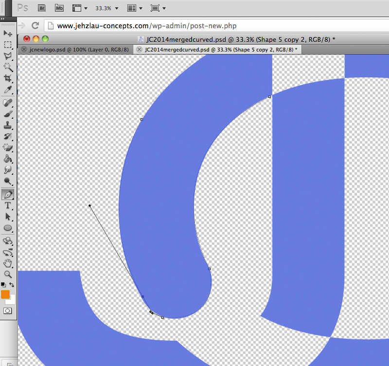
The making of the new JC logo:


The new logo I made is now vector-based. Unlike before I just doodled it using the brush in MS Windows Paint software, then re-doodled it using the Paintbrush in Photoshop CS5. Vector-based format is highly recommended so that if you resize your logo to a larger format than your based resolution, it won’t get pixelized.
Feeling nostalgic? Here’s an archive of my old logo:
Do you love the new jehzlau-concepts.com logo? Please share your thoughts below.
If you're already an expert in "Progressive Web Apps" and you already have a mobile…
Yep, you read it right. The Philippine currency (PHP / Pesos) ranked 5th in the…
If you're using Coins.ph to convert your BTC to Philippine Pesos like me, then you…
If you're already trading cryptos, then this post is NOT for you. This is a…
I love Coins.ph, it's convenient to buy mobile load, pay bills, and to send cash…
February 1, 2018 UPDATE The ETH wallet in the coins.ph Android app is now open…
View Comments
Wahhh.. nice.. pero yung mga icon ba jehz, ilalagay mo parin? Hehe.. nice design!!! :) :ipit:
Pinag iisipan ko pa. Na miss ko tuloy lalo na yang ipit. Hahaha! Pure css emoticons kasi gamit ko now :D
Guru ka tlga Sir Jehz - very versatile.... ganda ng new logo - super co.OL... Nga pla, akala ko nga Juan dela Cruz. JehzLau Concepts pla... Thumbs up Sir!!!
Nyay! salamat! Hahahaha. Juan Dela Cruz? Dapat JDC! haha :D
neat and nice! akala ko blue stickman na naputol ang paa, letters J and C pala na naging stickman! galing!
hahahaha! dugtong yan. Parang paa na naputol para mag form ng J and makita yung C. Wooot! :D
Kuya Jehzzz.. ikaw na talaga ang master ng mga master sardines.. heheh.. turuan mo ko niyan.. heheh
bat sardines? mukhang sardinas ba logo ko? O_O
Isa kang halimaw talaga Sir jehz. Nakakaamaze, active na talaga ulit ang Jehzlau Concepts :)
yeah! salamat sa hindi pag iwan sa Jehzlau Concepts! hahaha :D
Basta tulad ng sabi ko dati, astig ung new logo! Buti masipag sipag ka na ulit magsulat dito. Nakakatuwa!
yeah kelangan mag sipag para may makain. hahaha! salamat sa pag like ng logo :D
Para may makain talaga? haha
Ang cool ng Logo, its like jumping blue stickman or nakaupo, haha.. Ok na ok para sakin!
Hahaha! salamat. Nakaupo sya parang baby. :P
Congrats, nice stuff! personally I don't like photoshop, but seems you are doing great with it:)
Smooth. Napakakinis. :D
Awww. Thanks Jes. :)
Ganda ng new logo mo Jehz.. pero mas gusto ko ung dating color(darker blue)... :)
oo nga eh na miss ko din yung dark blue color. Iniisip ko if e revert ko to that color or not. Para same parin sa doodles ko. HMmmmmmmmmmmmmm..